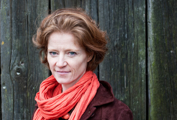
Film & Podcast | Sarah Dunning - Taking a position on motorway services
Tebay Services on the M6 has famously been described as the closest a motorway service area comes to Harrods Food Hall. It’s run by the Westmorland Family, whose current chair is Sarah Dunning. We were delighted to talk to Sarah as part of the Position Project.
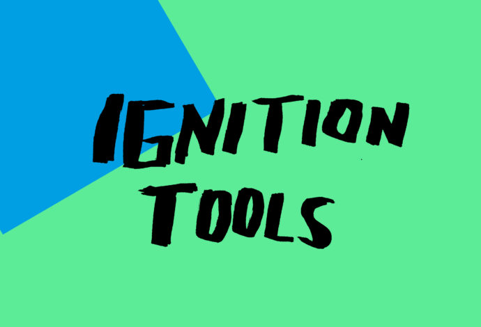
Ignition Tools | Four ways to kickstart the process of building your brand
We’ve produced a series of tools built around our Combustion method for plugging creativity into the heart of your brand’s strategy. They’ll give you insight into our thoughts and techniques and suggest how partnering with us can drive your brand’s momentum.


